The Color of the Year 2020 Stays Around for More than One Year
Many people think that a color trend lasts about a year, and then by the following year, that color is no longer on-trend. That might be what many retailers and manufacturers would like people to think because it can boost sales, but it isn’t true.
Yes, talking about color trends and naming a color of the year has become a useful marketing tool. Still, trends evolve over several years rather than changing entirely from year to year. Anything that comes into favor and disappears within a year or so is a fad. Trends generally last for four to seven years.
The takeaway? Just because we are talking about 2020 colors, it does not mean that the colors named last year have fallen out of trend. As things in the world change, so do our emotions, and thus the colors we want to surround ourselves with, but it rarely a significant change. It is a subtle shift from year-to-year. If you look back four or more years, you can see a more drastic difference between what is popular now versus what once was on-trend.

Each color has merit. Each company has put time and resources into making their selection. They have done the research, debated the findings, and come to a consensus about what colors will be necessary. You may not agree with a color choice, but just because it doesn’t hit home with you doesn’t mean that it is not an essential color for the upcoming year.
Some may say that Pantone’s pick is the color of the year. Last year, I talked about why a paint companies color of the year may be the one consumer gravitate to more than the color released by Pantone. I feel just as strongly about that point this year, and you can find my reasons here. Be sure to read to the end of the article where you will find the two questions to ask about any color trend. These can help you better understand the colors we are talking about here as well as any trend colors.
If you are still wondering which is the real color of the year, the answer is all of them. If you’re looking for a single solution, then go with the color of the year that resonates most with you.
BLUE TAKES THE TOP SPOT
Most years, consumers see each company offering up a unique color as their top color. When two companies name the same color as Sherwin-Williams and Benjamin Moore did with white as the Color of the Year 2016, there may even be speculation about copying each other.
Rather than raising eyebrows, I think it shows that the process has credibility. After doing the research and talking it out, color forecasters from different organizations have recognized the intense feelings and desire for a particular color. The same is true this year with the color blue.
WHAT IS THE COLORS OF 2020?
PPG 2020 Color of the Year Chinese Porcelain PPG1160-6
Courtesy of PPG
Blend of cobalt; moody ink blue offers escapism in
today’s data-driven society.
Dark blue has no gender, no agenda, and no controversy. It is a sure thing in a world of uncertainty.
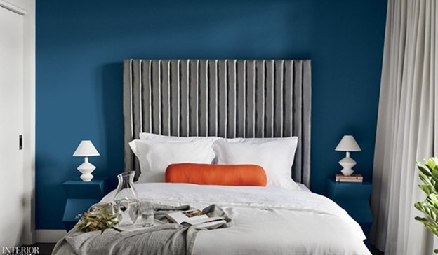
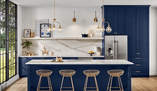
Sherwin-Williams Navy SW 6244
Courtesy of Sherwin-Williams
Beyond the blue: On the horizon between ocean and evening sky
rests a color of infinite calmness.
Over the past couple of years, more people moving away from using only neutrals, adding color to give their home personality.
This change is driven, in part, by a trend direction. Full Circle – Our innate need for connections drives concern and compassion for others and the earth. Rather than standing apart, we strive to live in step with our world, embracing the yin yang of opposing but complementary forces on earth. Our evolving view of the world comes to life in colors that feel stable and balanced yet vibrant and fully alive.
This classic color has even taken on new life in fashion as a color that can stand shoulder to shoulder with black at the most formal of occasions.
A color that has long been an interior decorating favorite don’t be surprised if you see more dark blue exteriors. Naval and other deep blues are more approachable colors for those who are drawn to the trend of black exteriors but not ready to venture that far into the dark side.
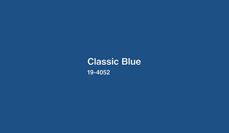
Pantone Color of the Year 2020 Classic Blue 19-4052
Instilling calm, confidence, and connection, this enduring blue hue highlights our desire for a dependable and stable foundation on which to build as we cross the threshold into a new era.
When the color was released, Pantone also added that “As technology continues to race ahead of the human ability to process it all, it is easy to understand why we gravitate to colors that are honest and offer the promise of protection.
people are drawn to colors that make them feel better and more hopeful, After the financial crash, we saw a desire for optimistic, bright colors. Now we are more cautious and feel a need for color but need something more stable and trusted. Blue — the color most often named as a favorite of both men and women — fills the bill perfectly.
Classic Blue is a color that is as comfortable as a favorite pair of jeans. Who wouldn’t want to blanket themselves in this accepting color when what most of us need more than anything is a restful night’s sleep and sweet dreams for tomorrow?
Behr 2020 Color of the Year Back to Nature S340-4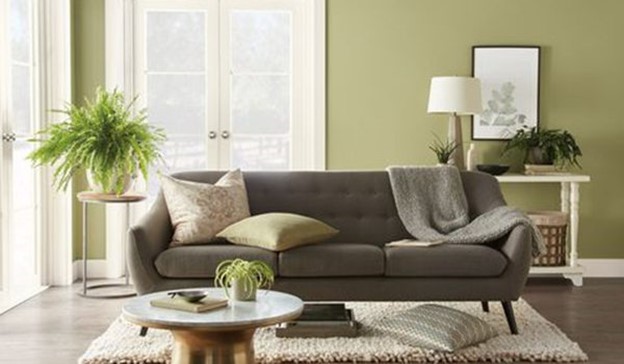
Courtesy of Behr
Back to Nature perfectly captures the essence of subtle and effortless green that can be found in a wilderness landscape or an indoor garden.
The freshly announced 2020 Color of the Year is an organic shade of green meant to purify and promote balance at home. As nature’s favorite color, Back to Nature is a restorative and revitalizing green hue that engages the senses and pairs well with other colors both inside and outside your home.
Green continues to be a color that draws people to it because of its ability to relieve stress, quiet the mind, and promote tranquility. Like blue, this nature-based green is comforting, but the attraction goes deeper.
For many, a new nomadic lifestyle is replacing the goal of settling down. While blue speaks loudly to stability, green connects with this adventurous spirit.
With mobility and freedom in mind, the focus turns to what is essential and meaningful in life. Anything more will weigh us down physically, mentally, and emotionally. We want to travel lightly, be positive, and embrace every experience.
Designs that support a lighter lifestyle are clean, sophisticated, functional, adaptable, and green.
AkzoNobel 2020 Color of the Year Tranquil Dawn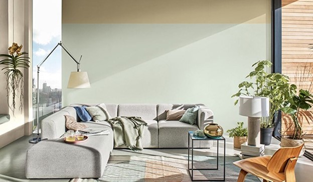
Courtesy of Dulux
A delicate, fluid shade somewhere between green, blue and grey.
Tranquil Dawn perfectly captures the 2020 mood of what makes us human. It’s reminiscent of the colors of the morning sky and encapsulates our desire to treasure our most human qualities, which we’ll need in the new decade we are entering.
There is more to this color than its connection to nature. If that is the only aspect you think about when seeing this soft, cool green, you may be missing out on an essential element of design influencing a range of light, delicate hues.
Design goes beyond “form follows function” as materials and technology integrate to produce designs focused on well-being. Using what scientists have learned about how visual aesthetics can impact our brains and physiology, designers employ color, lighting, sounds, scents, and textures to stimulate our senses.
The feel of a surface is as important as its look and must appeal to all of our senses. Softness in color and tactile materials drive designs that nurture the spirit.
Benjamin Moore 2020 Color of the Year
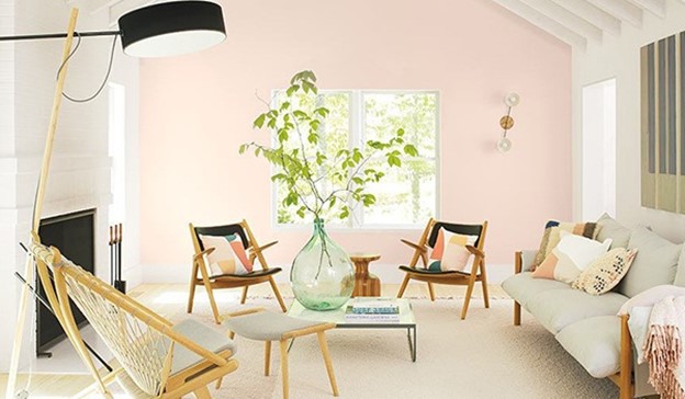
Courtesy of Benjamin Moore
A refreshing wash of pink, First Light 2102-70 uplifts.
A fresh palette. A revitalized spirit. A soft, rosy hue blooming with potential. Benjamin Moore’s Color of the Year 2020, First Light 2102-70, is the backdrop for a bright new decade.
A gentle pink hue, First Light feels like it is born of the same trend direction as Tranquil Dawn. Even the names are quite similar. Although the colors are from different color families, both are on the cooler side and evoke a similar mood.
Whether at home, work or out in the world, we seek spaces where we can be ourselves to do and dream. To confidently breathe in life and calmly exhale our truth. We desire ease in all that is essential to life. First Light has a softness of color that nurtures the spirit, gently soothes the mind, and “is the backdrop for a bright new decade.”
Source: sensationalcolor.com
Edited by Mita Purbasari